Read Full Post

An Artistic Look At The iPhone 5 Speculation [Infographic]

Apple products like Mac, iPhone, iPod, iPad etc always keep their positions in the technology news. Now a days, everyone is looking at the upcoming release of iPhone 5 and many people has different insights about it which they are sharing with the world. These unofficial insights about iPhone 5 are getting it to the higher level of popularity in the form of rumors before it will hit the market. Here, you can find below is an easy to understand example of infographic that covers almost all of the rumors going around about the upcoming iPhone 5 in an artistic form. In this graphic, you can see chances of new features expressed in percentages.

By Team
Read Full Post

The Evolutionary Tale Of Web Design (Infographic)

Evolution of web design is also one of the fastest known evolution in last two decades. Who would have thought that an early ages infant style web design will become must-have for everyone. This infographic illustrates the journey of web design that started as a baby which became the industry on web in these two decades.

By Team
Read Full Post

Where Oh Where: Current State Of World’s Data Storage (Infographic)

Are you wondering where is all digital data of the world being stored? No one can give you accurate answer but yes all those data stored at multiple locations worldwide. There are so many data centers who hold these data. If we talk about other type of mediums too so we have regular hard drives, optical drives, digital tapes etc are few of the main storage devices. This infographic illustrates the current state of data storage with noticeable statistics.

By Team
Read Full Post

How The Internet Is Killing Our Planet (Infographic)

It’s not that easy to believe and understand that we are killing our planet’s environment every time we use internet for any task. Yes, you read it right, while majority of the global names are trying to incorporate eco-friendly green environment but at the same time with the usage of internet for any of our tasks we are probably destroying all those efforts. You will be amazed to know that every month Google produces 260,000 kg CO2 to process user searches that is enough to power a freezer for 5,400 years. This is one of the million examples. In this post, you can find below is a well designed and easy to understand example of infographic that show the how internet is killing our planet.

By Team
Read Full Post

Awesome Yet Revealing Stats And Facts About Twitter (Infographic)

Who would have thought that a unique online project started in the mid 2006 will become one of the most popular and demanding micro-blogging service on internet with a name of twitter. After 5 successful years, it has now holds more than 75 million users worldwide that collectively generates 140 million tweets per day and about 1,600 tweets every second. It’s quite hard to believe but twitter plays an active role in purchasing decisions too. There are so many awesome yet revealing stats and facts about twitter which you might like to know. Check out the infographic below to find out those interesting numbers which you otherwise would never found.

By Team
Read Full Post

40 Insightful (Yet Deadly Creative) Infographics

Infographics can be defined as an emerging form of graphics which represent data and information in a very appealing and creative manner. If used wisely, it can produce deadly effect on your overall design of your web project. With infographics, you are in full control to convey knowledge and engage its viewers.

By Akhter
Read Full Post

The Statistical Journey Of Mozilla Firefox So Far (Infographic)

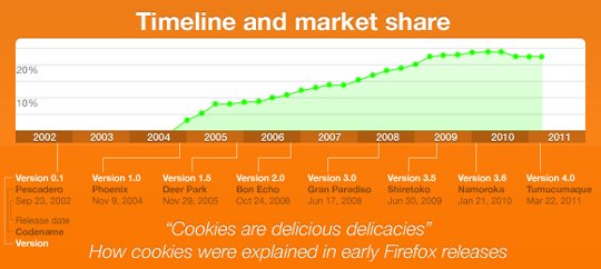
As we know web browsers are a necessity for us to browse the world wide web and web browser isn’t just a software which was once created and we have been using that same application today. Like technology, it has evolved from time to time, and there are a few big companies who are constantly participating and struggling in the browser’s war. Mozilla Firefox is one of those browsers which is growing everyday. They launched Firefox 4 in March 2011 that was downloaded 7.1 million times in the first 24 hours, and is now more than 100 million downloads and counting. Below you can find a great statistics of the journey of Mozilla Firefox so far.

By Team
Read Full Post

The Current State of Mobile App World (Infographic)

The trend of having a mobile version of any website or application is growing very fast. The main reason behind this trend is a rapidly increasing usage of smartphones all over the world. And ofcourse no brand would ever want to loose their mobile audience. That is no surprise if we take into account that 5 billion apps were downloaded in 2010. There are some serious predictions that 21 billion apps will be downloaded by 2013. What are the other numbers behind the present and the future of the Mobile App World? In this post, you can find below is a well designed and easy to understand example of infographic that shows the current size of state of mobile apps world.

By Team
Read Full Post

LinkedIn Connects 100 Million Professionals Worldwide (And Counting) To Make Them More Successful (Infographic)

In march 2011, LinkedIn reached it’s major milestone that connects over 100 million professionals in the vast area of expertise. They are now growing at roughly one million new LinkedIn members every week, the equivalent of a professional joining the site at faster than one member per second. Isn’t that amazing? It shows that they are really making great progress toward their ultimate goal to connect all of the world’s professionals to make them more productive and successful. In this post, you can find below is a well designed and easy to understand example of infographic that shows the current size of LinkedIn, both in user growth and user engagement.

By Team
Read Full Post

An Extensive Rumor Roundup About iPhone 5 (Infographic)

Apple products like Mac, iPhone, iPod, iPad etc always keep their positions in the technology news. Now a days, everyone is looking at the upcoming release of iPhone 5 and many people has different insights about it which they are sharing with the world. These unofficial insights about iPhone 5 are getting it to the higher level of popularity in the form of rumors before it will hit the market. Here, you can find below is a well an easy to understand example of infographic that show the covers almost all of the rumors going around about the upcoming iPhone 5. Not even this, they also added the blue progress bars for all the covered rumors to understand the possibility ratio that a given rumor will occur.

By Team
Read Full Post

Current State Of Freedom On The Internet (Infographic)

That’s not new for most of us that there are so many countries where government controls the internet and don’t allow their peoples to use internet without censoring specific or some contents. Every country has different content to censor but some of the most commonly censored contents are Pornography, Social Networks, Wikipedia, Wikileaks, Political Blogs, Religious Websites and Video Streaming Websites. They use advance internet monitoring and censoring technology to stop their nation for using the censored content. In this post, you can find below is a well designed and easy to understand example of infographic that show the current state of freedom on the internet to find who and what are censoring by which countries.

By Team
Read Full Post

The Evolution Of Web Browsers (Infographic)

As we know web browsers are a necessity for us to browse the world wide web and web browser isn’t just a software which was once created and we have been using that same application today. Like technology, it has evolved from time to time, and there are a few big companies who are constantly participating and struggling in the browser’s war. This infographic shows us the perfect comparison over different web browsers from 1994 to 2011. Some of these browsers perished with time while some are still competing.

By Team
Read Full Post

Who Likes What On Social Media (Graphic)

I have recently came across to really interesting infographic about “Who Likes What: Social Media By Demographic”. This graphic was beautifully executed to demonstrate that who likes what and how different social media channels make an impact. This well-presented infographic breaks down the top social networking sites by gender, age, income, and education demographics. The sites included in this graphic are Digg, Facebook, Twitter, MySpace, StumbleUpon and YouTube. To acknowledge this amazing work I want to give 5 stars to KISSmetrics who created this infographic.

By Team
Read Full Post

The Road To Internet Explorer 9 (Infographic)

Internet Explorer 9 is the hot news now a days for all internet users, specially designers, developers etc. who are browser conscious and have had a bad experience with IE 6. IE came a long way and there was a time when it was unbeatable in the browser wars, but its usage and market share starts dropping because of other more powerful browsers like Firefox, chrome etc. Now IE 9 is out and this infographic shows clear fact and figures that how IE reached form version 6 to version 9.

By Team
Read Full Post

10 Most Insightful Infographics About Internet

This post is dedicated to the creative examples of infographics with revealing facts and statistics about internet. With the help of these infographics, you will get an idea in one place that how bigger is the Internet and how amazing all the statistics are. The execution of these infographics are quite well with easy to understand presentation in creative manner. This list is not long in numbers, but I promise you that when you start watching them it will really amaze you.

By Team
Read Full Post

An Illustrated Evolution Of Media Content (Infographic)

Recently, I have found an infographic “Content – an illustrated history” created by Sheldrake & Karoshikula who creatively illustrated the history of media content from cave paintings to this digital era.

Who would have thought thirty years ago that the Internet would go mainstream and the World Wide Web would transform content business models (and many other business models come to that) so radically? I am fascinated with the history of media and content, its present and its future, and being a communicator I wanted to share my awe in a way that would prompt others to share it with their friends and family. So I joined forces with Nic Hinton, an outstanding illustrator, to design “Content – an illustrated history”.

By Team
Read Full Post

How Big Is The Internet? (Infographic)

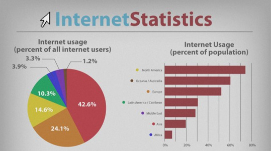
Who would have thought that a little research project that was initially experimented for specific group of people called “ARPANET” will transform the world and get the revolution that will change the life of every individual. Started from early 1960′s to the 2010, it changes lots of faces and expanded like a spider web. But there are so many of us who love to see the statistics. Here, we have found an infographic in which you can see the periodic growth of internet from 1998 to 2010 in a very attractive manner.

By Team
Read Full Post

Graphic: The Top 20 Passwords Of All Time (That Need To Be Avoided)

I have recently came across to really interesting infographic about “The Top 20 Passwords Of All Time”. In a recent survey conducted by ZoneAlarm, 79% of consumers were found to use risky password construction practices, such as using personal information and common words. The graphic below illustrates some of the most commonly made mistakes people make when selecting a password, as well as some tips on how to make your password more secure. To acknowledge this amazing work I want to give 5 stars to ZoneAlarm who revealed these information in an easy to understand infographic.

By Team
Read Full Post

How Bigger The Internet Would Become By 2020 (Infographic)

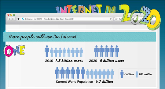
Who would have thought that a little research project that was initially experimented for specific group of people called “ARPANET” will transform the world and get the revolution that will change the life life of every individual. Started from early 1960’s to the 2010, it changes lots of faces and expanded like a spider web. But there are so many of us who are looking forward on it’s expansion but the current growth making it’s harder to predict. Here, we have found an infographic in which you can see the predicted growth of internet in next 10 years based on rough estimate.

By Team
Read Full Post

The Evolution Of The Photoshop (Infographic)

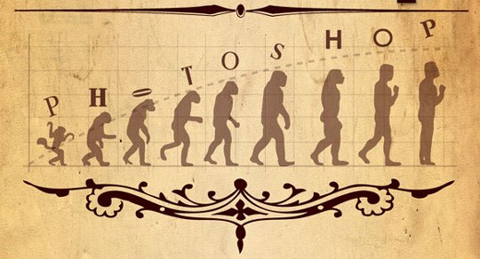
Evolution of Photoshop is one of the fastest known evolution in last two decades. Who would have thought that a little software will become a giant in short period of time. This infographic illustrates the journey of Photoshop that started as a baby which became the industry leader in these two decades.

By Team
Share