Click here to buy secure, speedy, and reliable Web hosting, Cloud hosting, Agency hosting, VPS hosting, Website builder, Business email, Reach email marketing at 20% discount from our Gold Partner Hostinger You can also read 12 Top Reasons to Choose Hostinger’s Best Web Hosting
Responsive designs have become a necessity of the time, and in this day and age it is very surprising to see when a website is not responsive. The most challenging part of developing a responsive website design is to create a cool and appealing menu design that can work on small as well as large screens.
So, here is the complete list of 37 Best Responsive Navigation and Menu Patterns and tutorials for your use. We hope that this collection proves to be the best and will help you get going in the initial phases of your UI designing project.
And it is once again our pleasure to share with you what we have gathered from all over the web so to help you with your masterpieces. Click through and feel free to download.
Tip: You can make sure everything you type is clear, effective, and mistake-free with Grammarly, It scans your text for common and complex grammatical mistakes, spanning everything from subject-verb agreement to article use to modifier placement.
FlexNav is a mobile-first example of using media queries and javascript to make a decent multi-level menu with support for touch, hover reveal, and keyboard tab input accessibility. Special attention is paid to touch screens using tap targets (the key feature of FlexNav).
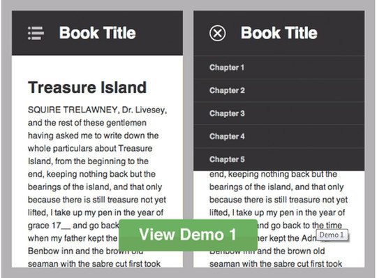
A responsive web design to hide top navigation into a navigation drawer on Tablets and Mobile Phones.
Pushy is a responsive off-canvas navigation menu using CSS transforms & transitions.
Possibly the most advanced website menu script today. And it’s free.
The best jQuery plugin for creating side menus and the easiest way for doing your menu responsive.
Responsive and Touch-Friendly.
jQuery Navobile – a jQuery plugin that makes mobile navigation easy
A jQuery plugin that makes mobile navigation easy.
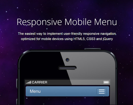
The easiest way to implement user-friendly responsive navigation optimized for mobile devices using HTML5, CSS3 and jQuery.
Responsive Mobile Menu Plugin for jQuery.
CSS-Tricks – Responsive Menu Concepts
The Responsive Select Menu plugin automatically turns any WordPress 3 Menu into a select box / dropdown on mobile devices.
Responsive menu patterns by Erick Arbe
Codrops – Responsive Multi-Level Menu
A responsive multi-level menu that shows its submenus in their own context, allowing for a space-saving presentation and usage.
Responsive Nav – responsive navigation plugin
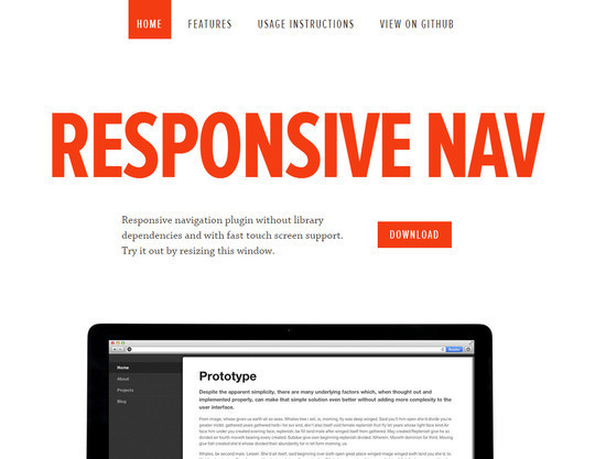
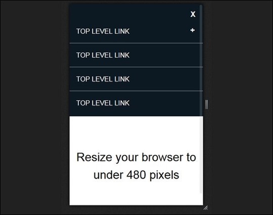
Responsive navigation plugin without library dependencies and with fast touch screen support. Try it out by resizing this window.
Implementing Off-Canvas Navigation For A Responsive Website
jPanelMenu – a jQuery plugin that creates a paneled-style menu
jPanelMenu is a jQuery plugin that creates a paneled-style menu (like the type seen in the mobile versions of Facebook and Google, as well as in many native iPhone applications).
Mmenu – jQuery responsive menu plugin
The best jQuery plugin for app look-alike on- and off-canvas menus with sliding submenus for your website and webapp.
slimMenu – a lightweight jQuery plugin
slimMenu is a lightweight jQuery plugin, which is made to create responsive and multi-level navigation menus on the fly.
Navigataur.css – a pure CSS responsive navigation menu
A pure CSS responsive navigation menu.
Navgoco – Multilevel Slide Menu
Navgoco is a simple JQuery plugin which turns a nested unordered list of links into a beautiful vertical multi-level slide navigation, with ability to preserve expanded submenus between sessions by using cookies and optionally act as an accordion menu.
Responsive Navigation Patterns by Brad Frost
DROP DOWN RESPONSIVE MENU WITH CSS3 AND JQUERY
In this tutorial, we’ll create a beautiful drop drown responsive menu with new feature of css3 (media queries) and jQuery library to enhance the design and layout of a website navigation menu to fit different screen sizes. We have design to change the layout from big computer screens to smaller screens mobile support, to make it responsive displa.
Mobile screen real estate is at a premium and one of the biggest problems to solve is how to display navigation when screen widths become quite narrow so I decided to have a look and see what I could come up with using some nifty CSS and a touch of jQuery.
In this tutorial, we’ll create a responsive menu with new feature of css3 (media queries) to alter the design and layout of a website navigation menu to fit different screen sizes. We have design to change the layout from large screens to smaller screens support, making it responsive display.
A Simple, Responsive, Mobile First Navigation
We’re going to build a simple, responsive web site navigation. Our solution will help us place emphasis on the content of our page, arguably the top priority when designing for mobile. There’ll be no JavaScript involved, and we’ll tackle it from a Mobile First approach.
Responsive Drop Down Navigation Menu
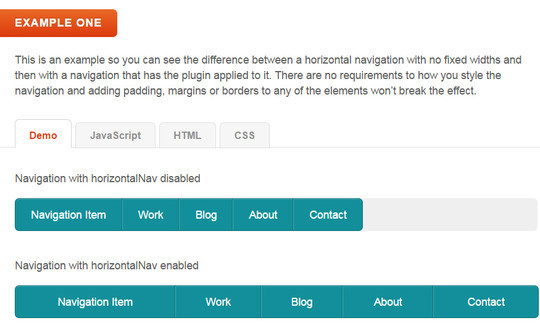
HorizontalNav is a jQuery plugin that spans a horizontal navigation to fit the full width of it’s container. If you’ve ever had to create this effect on a project, you’ll know it’s pretty annoying to do. But this plugin makes it easy and adds support for IE7.
Progressive and Responsive Navigation
HorizontalNav is a jQuery plugin that spans a horizontal navigation to fit the full width of it’s container. If you’ve ever had to create this effect on a project, you’ll know it’s pretty annoying to do. But this plugin makes it easy and adds support for IE7.
Responsive Design Approach for Navigation
HTML5 Responsive Menu with Media Queries JavaScript
Responsive navigation menus come in all different shapes and sizes, you might recall my post on creating a dynamic select menu from an existing menu, which is one method. So let’s visit another. The ‘in-page’ navigation.
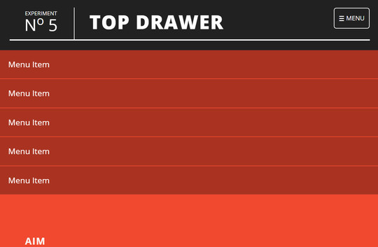
To demonstrate smoother reveal menus in small contexts using CSS3 rather than animating with JavaScript.
How to Build a “Three Line” Drop-down Menu for a Responsive Website in jQuery
In this tutorial we will learn how to Build a “Three Line” Drop-down Menu for a Responsive Website in jQuery.
Today I’m going to tell how to create a responsive navigation menu using only CSS3.
Code A Responsive Navigation Menu
A simple, javascript free responsive menu.
One of the trickiest parts to be responsified on a website is “the Navigation”, this part is really important for the website accessibility, as this is one of the ways visitors jump over the web pages.
Now loading...


