Are you looking for some detailed tutorials on creating creative responsive web designs? Well, if your answer is yes, then stop looking any further. In this post, we have put together more than 11 most creative and useful detailed tutorials that will teach you how to create interactive responsive web designs.
So feel free to browse through this collection and make the most out of these tutorials. You can experiment with different things to make your web designs even more eye catching and attractive. Do let us know via comment section below that how do you find these tutorials. Are they useful for you? Have fun and keep visiting.
Tip: If you are looking for a visual wordpress theme builder then Divi theme builder would be the right choice to end your searching and start discovering it for your next project. Divi is more than just a theme, it’s a website building framework that makes it possible to design beautiful websites without ever touching a single line of code and without installing and configuring dozens of disjointed plugins. We think this is the future of WYSIWYG, and it’s unlike any WordPress theme you have used before.
How to Turn Any Website into a Responsive Site
Here we’ll see a few ways to take your current site and turn it into a mobile friendly one, with little effort. We’ll see CSS basics, HTML optimization, WordPress and jQuery plugins and other cool stuff you should be aware of. So, let’s rock!
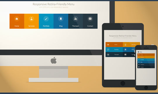
A responsive, touch-friendly and Retina-ready menu with three layouts for different browser sizes.
Responsive Web Design Guidelines and Tutorials
In this overview you will find the most useful and popular articles we have published on Smashing Magazine on Responsive Web Design.
Flexible Slide-to-top Accordion
In this tutorial we’ll be creating a simple responsive accordion that, when opened, will slide to the top of the viewport and reveal the content by fading it in.
Making SVGs Responsive with CSS
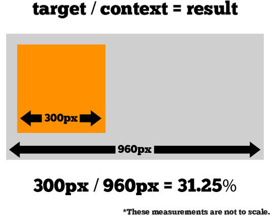
An article on how to make embedded SVGs cross-browser responsive. We’re going to cover embedding techniques, how to apply the “Padding Hack” and how to use inline media queries to make SVGs adaptive.
Responsive Web Design using CSS3
Smartphone revolution brings new features to the web development, it is time to change your website design into a responsive design instead of maintaining a separate mobile version . Responsive design will automatically adjust itself based on the screen size of the media devices. This post explain you how to use CSS 3 @media property and working with Internet Explorer using Modernizr.
Expanding Search Bar Deconstructed
A tutorial on how to create a mobile-friendly and responsive expanding search bar.
Beginners Guide to responsive Web Design
Over the past year, responsive design has become quite the hot topic in the web design community. If all the buzz has you feeling like Rip Van Winkle waking up in the 21st century, this summary will help you catch up with the times.
How to Create Responsive Images Using the Picture Element
In this short video tutorial, you’ll learn how to use the picture element to create responsive images.
Future-Proof Responsive Email Without Media Queries
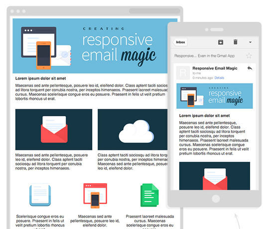
In this article you will learn how to create a Future-Proof Responsive Email Without Media Queries.
A Simple Responsive Grid, Made Even Better With Sass
In this tutorial we’re going to build a simple, responsive grid system using CSS. Once we’re familiar with how it works, we’ll improve it with Sass, learning some core Sass features along the way.
Now loading...


